
Have you ever wondered about what colours you should have your subject wear for photos…..or if there’s any colours that you should AVOID?
Although you can use any damn colours you wish, there are three colours (or actually, “sets” of colours!) that will simply make your job harder as the photographer, because they tend to “clip” easily - which is simply a way of saying that you’ll lose all detail in that particular area.
Wondering what they are….?!
Hit play on the video below to find out!
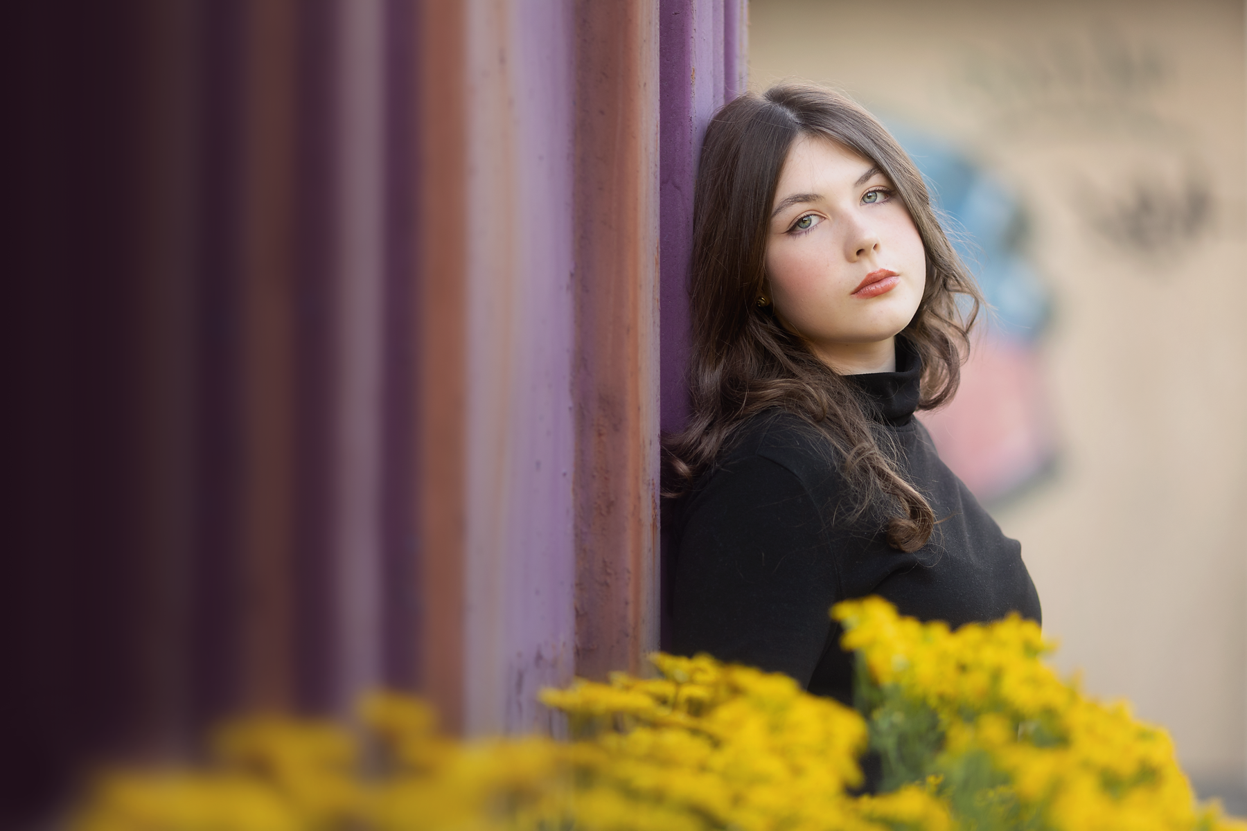
What actually goes into one photo? In this episode, we’re breaking down an image from start to finish — camera settings, composition, lighting choices, editing in Lightroom Classic and Photoshop — the whole shebang!
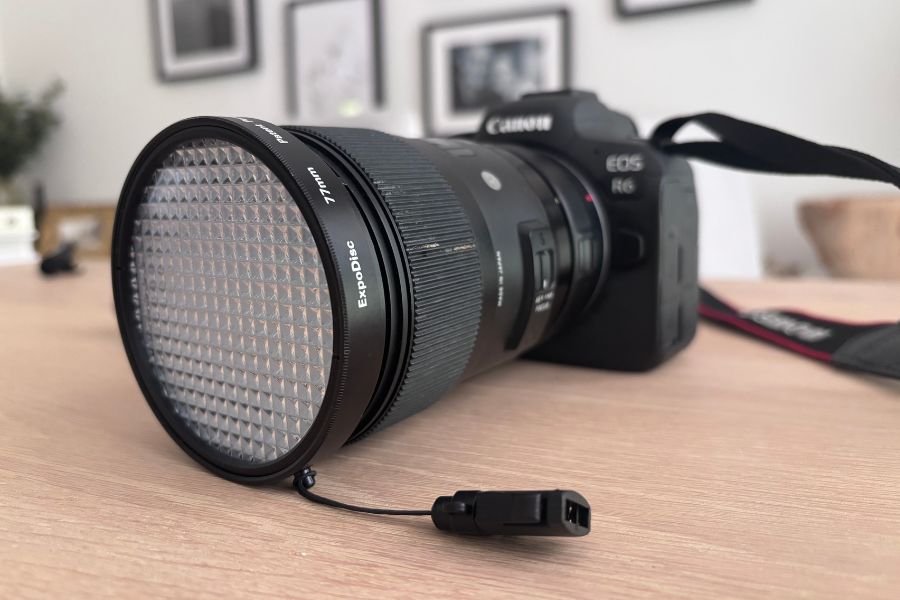
Learn how to use an ExpoDisc to set custom white balance for accurate colours and natural skin tones. A step-by-step beginner’s guide with tips and advice.
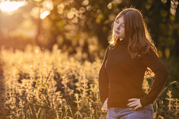
There’s a reason photographers LOVE golden hour! That soft, warm, honeyed light can make even the most everyday scene look absolutely magical ✨
In this guide, I’ll show you exactly how to make the most of it — including when to shoot, where to place your subject, which camera settings to use, and my favourite tricks for getting that gorgeous golden glow in your photos.

Ever taken a photo that looked perfectly fine through the viewfinder, only to realise afterwards that it’s way too dark? It’s one of the most common photography frustrations — but thankfully, it’s usually pretty easy to fix!
In this post, we’ll look at why your photos are coming out too dark, and the simple changes you can make to get brighter, beautifully exposed images straight out of camera.

10 simple, weekend-friendly, totally doable things you can try to boost your photography skills without spending a dime, blocking off six weeks, or binge-watching a three-hour tutorial that makes your brain hurt 😀

I’m going to give you a step by step guide to critiquing your own photos, so you can start to look at your own images objectively, see what you did right, and what you could do next time to improve your photos!

We’re breaking down exactly what the Lensbaby SOL45 is, who it’s for (hint: anyone craving a little creative magic), and what makes it so different from your everyday lenses. Plus, you’ll get a step-by-step tutorial so you can actually use it without wanting to chuck it across the yard, and some example photos too.

We’re covering everything you need to confidently decide which lens is your lens soulmate — the 35mm lens or the 50mm lens — including pros, cons, photo examples, and one very nerdy-but-helpful rule of thumb you’ll actually want to use.
Learn how to use complementary colors in photography, understand the color wheel, and balance contrasting colors to give your photos more punch.