
Want to give your photos a little more punch? Start by looking at the colors in your frame!
Color is just one of the composition tools you can use to make your photos more interesting, and it’s a fun one to experiment with!
Although there are many, many ways to use color, using complementary colors in photography is a simple way to add contrast and make your images more eye-catching.
So what exactly are complementary colours?
Well, these are colors that sit opposite each other on the color wheel, and pairing them together can give your photos that extra bit of pop - even if you don’t realise why!
Let’s look at what complementary colors are, how to find them, and how much of each color to include in your photos.
What Are Complementary Colors in Photography?
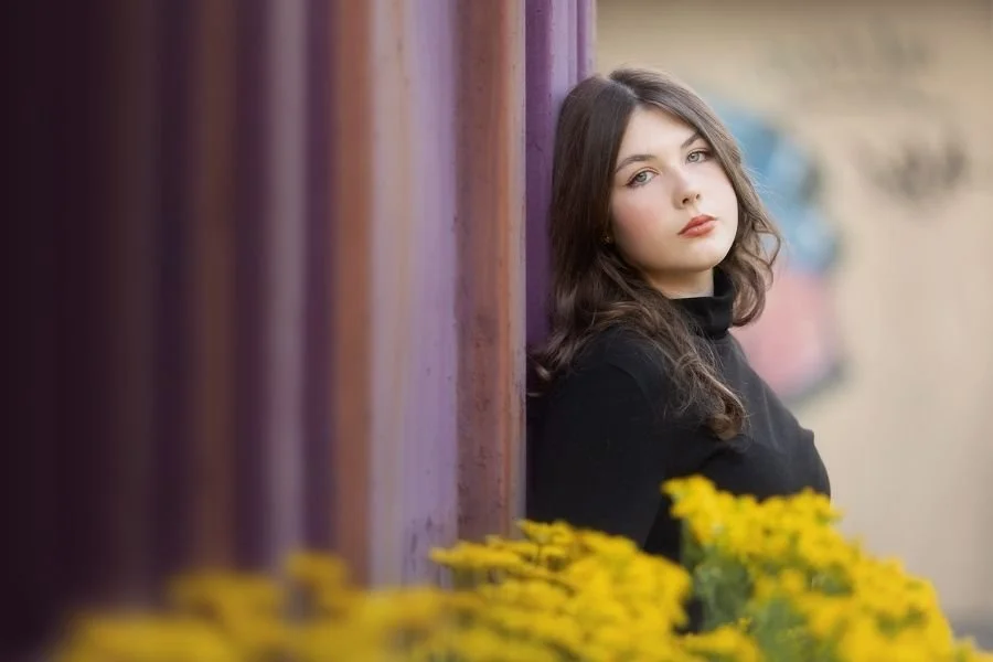
Complementary colors are colors that sit directly opposite one another on a color wheel.
Imagine drawing a straight line from one color, through the center of the wheel, to the other side. The color you land on is its complementary color!
On a traditional color wheel, the complementary color combinations are:
● Red and green.
● Blue and orange.
● Yellow and purple.
When you include both colors in a photograph, the contrast between them helps them stand out against one another. That’s what gives the image that extra punch!

Using the Color Wheel to Find Contrasting Colors
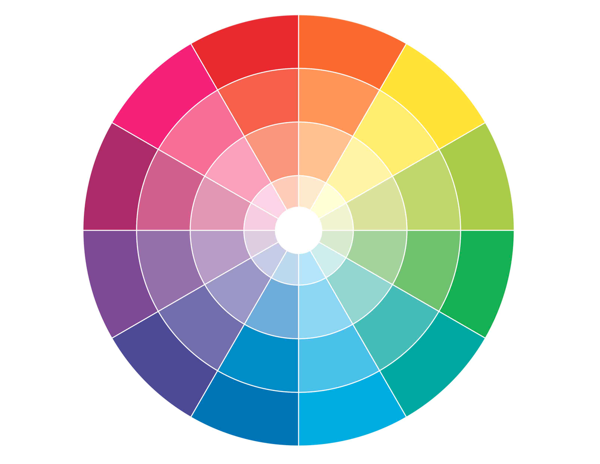
Now, if you are looking at the two color wheels above, you’ll probably notice that they are slightly different - that’s because there’s more than one type of color wheel!
On a traditional RGB color wheel, you’ll find red opposite green and yellow opposite purple.
On a color wheel based on light (CMYK) you’ll see different pairings, such as red opposite cyan and green opposite magenta.
So the exact complementary pairings depend on which wheel you’re using, but for the purposes of getting out there and taking photos, you don’t need to get bogged down in the differences!
Because although the direct opposite colors are slightly different with each color wheel, there are definite similarities between the wheels: greens twin with reds and purples, oranges with blues / greeny blues, and yellows with purples and blues.
Simply choose one wheel as your guide and use it to find colors that sit opposite one another. Then look at the other and see if you like that pairing more!
(It honestly makes not a jot of difference which one you use, as they will both give you beautiful results)
Examples of Complementary Colors in Photography
Here are a few of my personal photographs that use complementary colors, so you can see how this works in practice.
As you look through them, notice the main colors in each image and how they contrast with one another.
You can also see that this works with ALL types of photos, from portraits to flowers, so there’s no excuse for not using it 😉
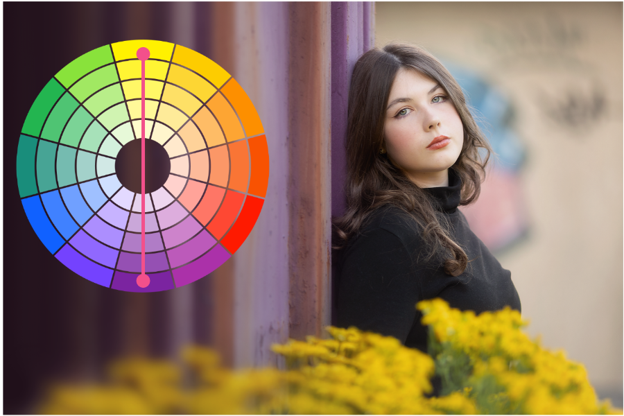
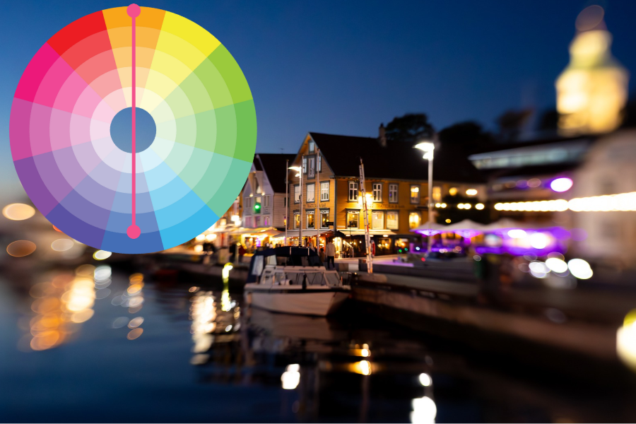
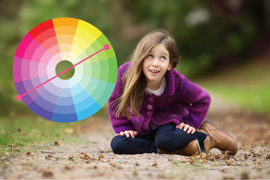
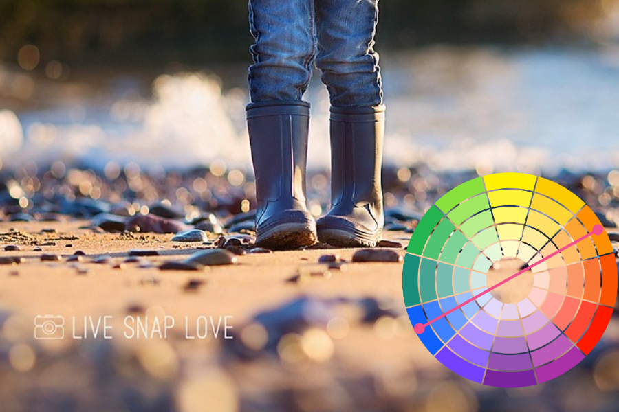
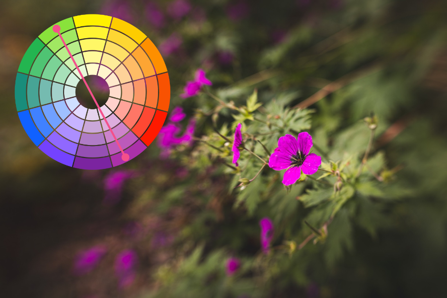
Also, take a look at how much space each color takes up in the frame.
You don’t need equal amounts of both colors to make this work!
Which brings us nicely to the next point…
How to Balance Complementary Colors in Your Photos
When you’re using contrasting colors in photography, it can help to let one color take the lead.
Equal amounts of two complementary colors can sometimes feel a tad overpowering, with both competing for your attention. Having more of one and less of the other can just help the image feel a tad more balanced.
As a starting point (although you can definitely 100% deviate from this!) try filling roughly two-thirds of your frame with one color and one-third with the other.
But please don’t feel you need to measure it out - there’a no exact ratio that makes every photograph work. It’s simply a starting point to play with, rather than another photography “rule: you need to remember.
If in doubt, try changing the balance and see which version you prefer.
You Only Need a Small Amount of Color Contrast!
Even little touches of complementary colors can be enough to add interest.
It could be something as small as a lipstick shade that contrasts with the color of a dress. Or you could have your subject hold a purple flower in amongst the green of the forest. Or when shooting during the blue hour, use a warm lamp to give a little bit of color contrast.
You might love the punch of two contrasting colors filling most of the frame, or prefer a smaller hint of color. Have a play with both and see what appeals to you.
Now this is just ONE way to use color - there are tons more, but this is a nice easy one to get you started.
Want something to practice with? Try this creative photography exercise in your kitchen! There are loads of opportunities to play with color without even leaving the house, and the kitchen is one of the best places for it 😉
Fancy getting a little more creative with your camera? Try these next:
Composition Tip - Use Triangles
10 Compositional Tools that Add Impact to Your Photos
Creativity Exercise: 30 Photographs in 30 Minutes