Comparing White Balance Methods
Please ignore everything else apart from the colour in these example photos - in other words, don't judge my poor composition and exposure! These are all SOOC (straight out of camera) with absolutely nothing done to them except saved for the web.
Comparison #1
So let's get started! For this first photo, my trusty model Pooh is sitting on a bed with natural light from a window camera left. This is one where I thought the settings would be quite close as it's pretty easy light...
So, as far as I can tell, the AWB setting is actually pretty much spot on. The Daylight preset is obviously way too green (not entirely sure why, thought that would be closer!) the grey card is maybe ever such a smidgen warm and the Expodisc is also bang on and wouldn't require any change. (If you are having trouble with seeing the white balances, look at the bedspread, it should look white) I completely forgot to do a Kelvin one for this, apologies.
Comparison #2
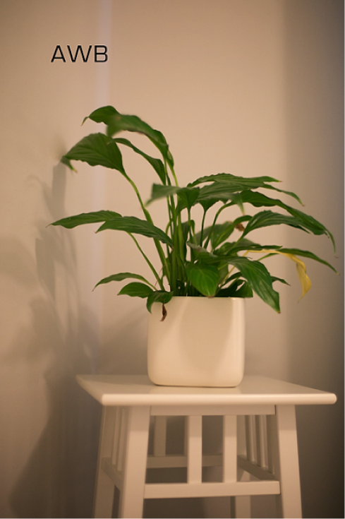
Here's another example, this time with a room lit by two small lampshades and an overhead bulb. This is where I think using something other than Auto or Presets is very important, and you will see why....
As you can easily see, the AWB and Tungsten Preset are way off - the AWB is way too warm and has too much magenta, and the Tungsten is also too warm and has way too much green. The grey card, Kelvin and expodisc are the closest, and all give a good starting point. (I should point out here that I originally set the Kelvin at 2500, took a picture, checked the image on the screen and saw it wasn't right so I changed it to 3000) The Kelvin is a smigden too green, we would need to add a little magenta, but easily fixed.
Now, these have all been very easy to judge because I deliberately taken pictures with a lot of white in them. Our eyes know what white should look like, therefore it's one of the easiest ways to see how close our white balance was in camera. We also have the benefit here of seeing a couple of different ones side by side.
Comparison #3
So, here's another image that we can't easily see which is the correct white balance, as the main subject is skin, and you can't really use skin to set a global white balance for the image.
AWB in this case is making his skin look grey (although to be fair I have underexposed a touch which is not helping) and Kelvin and Daylight are too green and would need a pull on the magenta slider. I would say the grey card and the expodisc are the closest. The grey card is probably reading a little warmer but for skin, that's OK, and the expodisc is looking accurate too!
Whilst breaking down all of these I would like to point out I am talking about accurate White Balance, but some images might look better warmed up a little, or cooled down, so sometimes you will want the WB to be "incorrect". However, in most cases you want the white balance to be accurate, and then edit this in processing to suit a particular mood or need as you wish.
So, what do these examples tell us?
I would say that although they will sometimes be correct, AWB or presets do not give as reliably consistent results as a grey card or the expo disc. Kelvin will get you close most of the time (if you know your numbers) but you will pretty much always need to tweak your green / magenta slider - this is not a problem, but be aware there will always be some changes required in processing. The two that are most consistent are the custom white balances - the grey card and the expodisc (Unfortunately I don't have a White Balance Lens Cap , but I'm going to assume that these give similar results to the grey card) so those would be my recommended methods - but you can read about all six different methods of setting your white balance in yesterdays post!
Hope some of you (who are geeks like me!) found that helpful!


